The Challenge
The Design
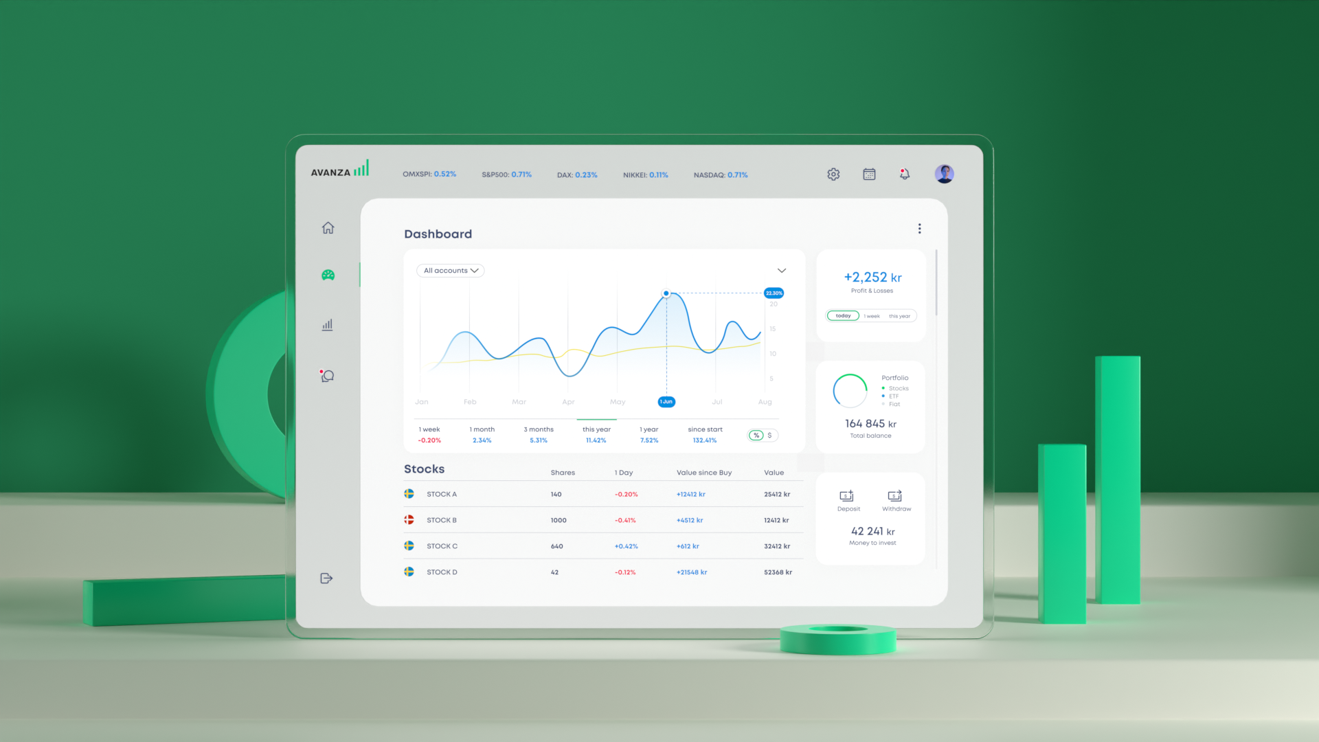
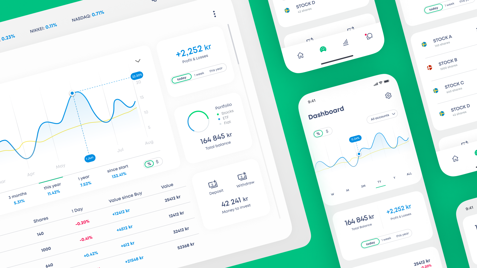
This design view show the most basic information that users need. There is a graph, a list of stocks, daily profits&losses etc. The idea is that if the user is missing information that they need, they will be able to change what is shown inside the app. This is a very crucial part of the design and user tests need to be done in order to see what the majority of users want.

The Background
Lynk & Co is a company owned by Chinese automotive company Geely Auto Group, one of the biggest automakers in the world. In 2010, Geely Auto bought the well-known car brand Volvo. I worked as a UI UX designer at Lynk & Co in Gothenburg from 2016 to 2021.
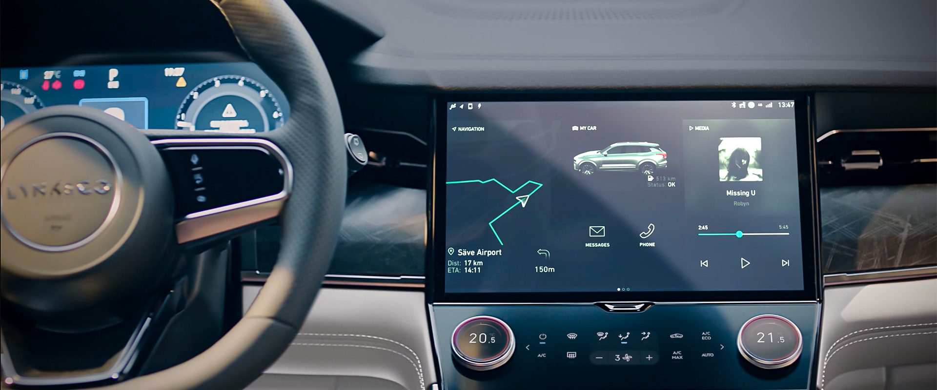
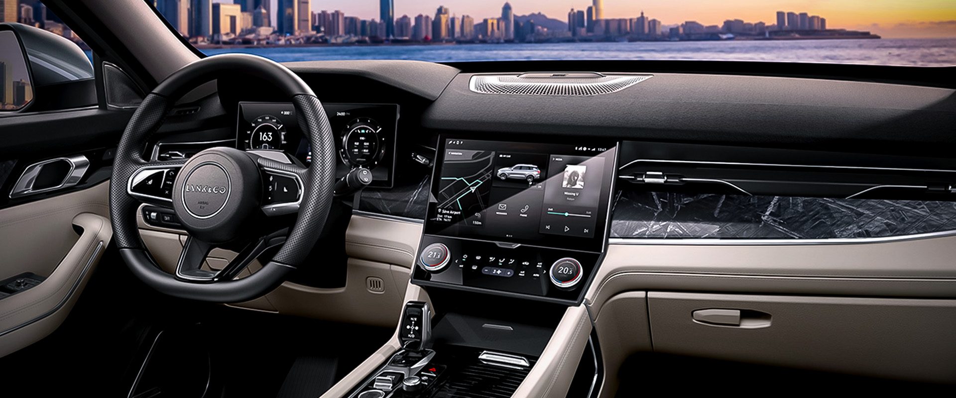
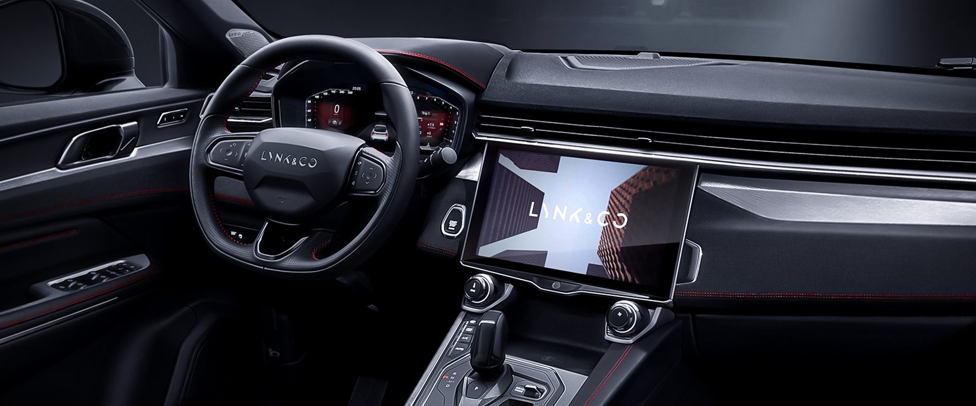
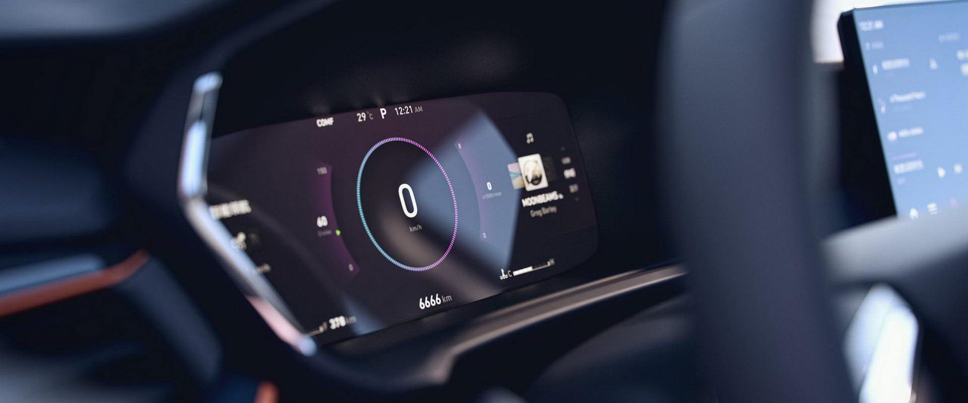
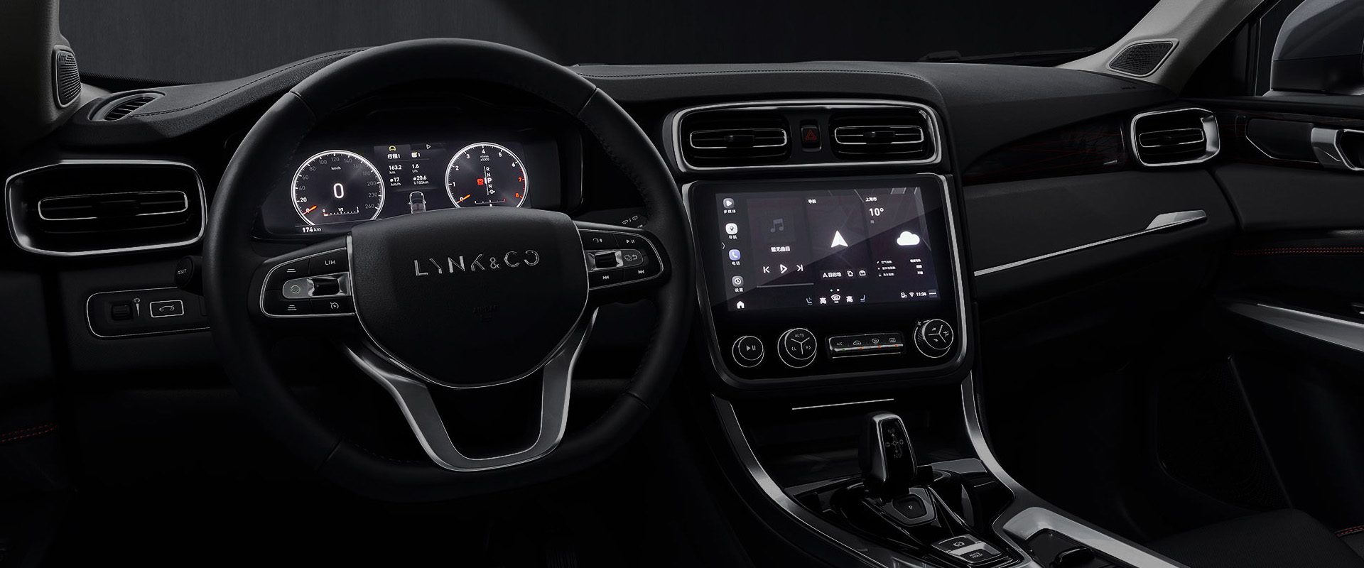
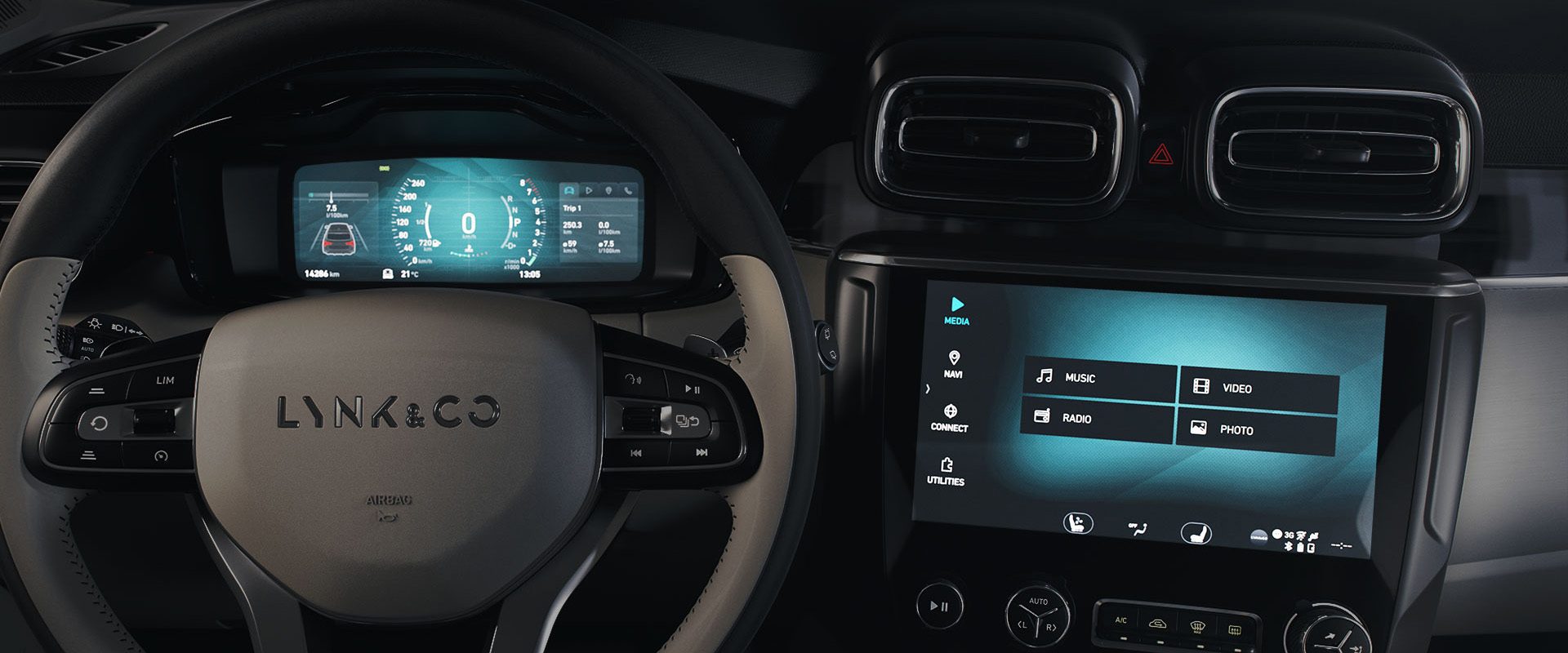
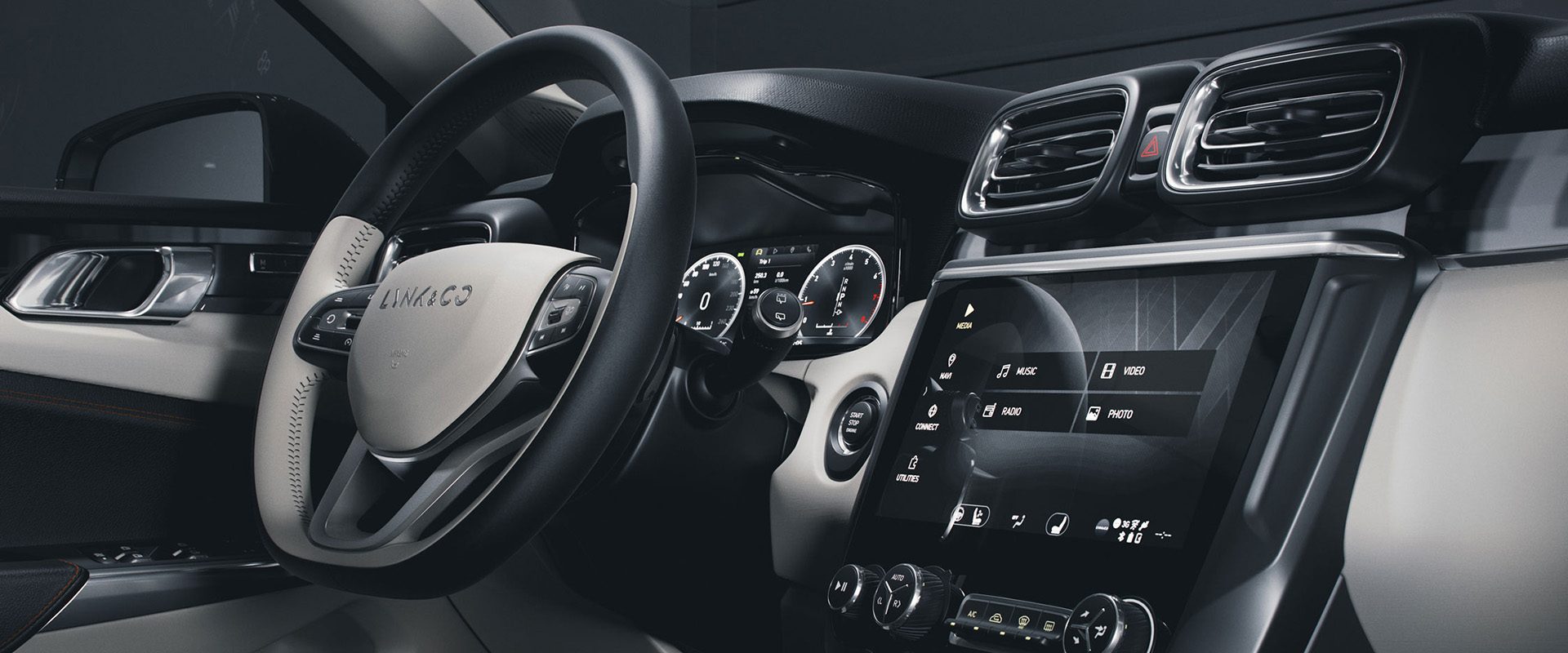
I started working with the first-generation cars in a small team, designing the infotainment system of the cars. My main responsibility was creating the UI for the driver display but I also did some UX for various screens. I have worked on Lynk&Co 01,02,03,05,06,09 cars.
The Challenge
Being a very young car brand it was a big challenge in creating graphics that would look and feel Lynk&Co. Many other car brands have existed for many decades and therefore have a solid design language that evolved over the years.
In the recent years we focused more on Lynk&Co as a brand and how we want to be percieved. This included looking at materials, patterns and colors used in the interior of the car and adapting the graphics to create a seamless design.
What I Learned
Frilans UI UX Designer
